The Font Series… Script

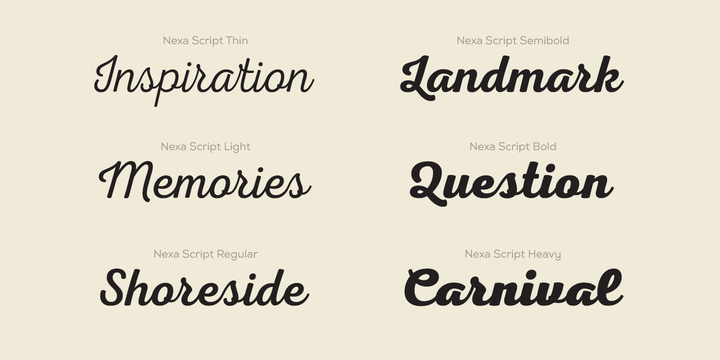
Script fonts can be best described as mimicking cursive or calligraphy. There are script fonts that connect, those that don’t, those that look handwritten, and those that look like calligraphy.

Script fonts should be used sparingly to keep your designs readability level high.

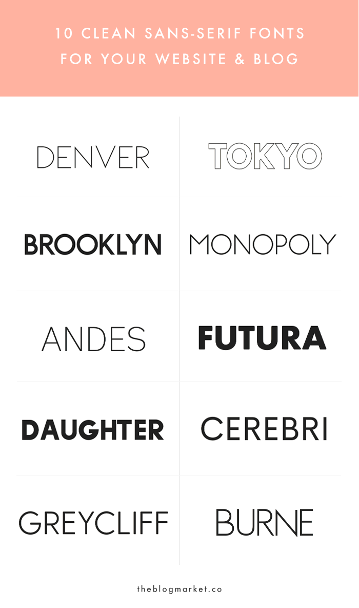
There are countless of script fonts out there, too many to narrow down which ones are the most popular. If you are looking for script fonts I would recommend checking out dafont.com.

Image result for script font family

Now that we know what script fonts are defined as, we can go a little further and research if script fonts are used in online design, where they should be used, and maybe where they shouldn’t be used. I am curious to see what others have to say about using script fonts in online design, because I was taught to use them sparingly in printed designs, and I wonder if the same rules apply to online design.

To start, I found an article from designhack.net where they list 7 tips for choosing the best fonts for a website.

The article starts by listing some basic fundamentals and definitions every web designer should be aware of. Although I knew most of these terms such as, kerning, leading, and contrast, I was surprised to read that you shouldn’t use more than three different typefaces. I knew to not use a lot of different typefaces, but three seems like such a small number.

The article advises designers to first get all of the text they need and then choose a font, instead of trying to decide on a font before even typing, which is something I am guilty of.

I had high hopes for this article because I thought it would be helpful for finding the best fonts to use online, and although it did link a few fonts they thought worked well on the web at the end of the article, the rest of the tips were a little vague and mostly things I already knew.

Although this article isn’s specifically about script fonts, I can take the tips to consider readability and not use more than three typefaces to conclude that script fonts should not be used in areas where there is a lot of text.

The Font Series… Sans Serif

Although I have a post talking about the difference between Sans Serif and Serif typefaces, I still decided to include both in this series because I didn’t mention the most popular fonts in each family.

Sans in french means with out, and Sans Serif fonts are fonts with out serifs. They are also described as being monoweight because there is no contrast between thick and thin lines.

Some popular Sans Serif fonts include:

  1. Brandon Grotesque
  2. Bailey Sans
  3. Folio
  4. Helvetica
  5. Verdana

It is important to note however that Helvetica and Verdana were designed solely for online use, and not print. This doesn’t really affect online web designers, but it is still an important design tip to know.

I think using a Sans Serif font online would be beneficial to any web designer because they are considered to be very easy to read, they aren’t as boring or overly used as some Serif fonts, and they are a simple way to incorporate design with out overwhelming your reader.

The Font Series… Slab Serif

Whoever comes up with these typeface family names really needs to consider moving away from the word Serif.

Slab Serif fonts can be defined as having a thick and thin contrast. Slab Serif fonts can also be referred to as Clarendon fonts because the font called Clarendon is the poster font for this typeface family. Slab Serif fonts are often used when designing something directed towards children because of their clean and straightforward look, which makes it easier to read for children

Some popular Slab Serif fonts are:

  1. Clarendon
  2. New Century Schoolbook
  3. Memphis

In my opinion, Slab Serif fonts are good for long bodies of text where you want your readability level to be high. However, I personally believe there are better fonts out there that could be used to show style while still having a high level of readability. There aren’t many articles out there that talk about Slab Serif fonts, and because of this I have decided they are an acceptable font to use in online designs, but you could probably do better and find a more interesting and engaging font.

The Font Series… Modern

Modern is the next typeface family we will talk about because it evolved from Oldstyle. Just like Oldstyle fonts, Modern fonts have serifs. However, unlike Oldstyle, Modern font serifs are horizontal instead of slanted.

When set to a large point size Modern fonts can be very striking and have a lot of visual impact. If you need to create more of a visual impact in your design consider using Modern fonts.

A few of the most popular Modern fonts include:;

  1. Didot
  2. Didot Bold
  3. Bodoni
  4. Modern No. 2
  5. Walbaum

The Font Series… Oldstyle

Oldstyle fonts were some of the first fonts created, and they were based off of the handlettering of scribes. All Oldstyle fonts have serifs, which are the tiny “feet.” Oldstyle font are different than Serif and Sans Serif fonts because the serifs of lowercase letters are always at an angle and have a curve where they meet the stem.

Oldstyle fonts are good to use because they are a classic and sophisticated typeface.

A few examples of Oldstyle fonts are:

  1. Times
  2. Palatino
  3. Garamond
  4. Sabon

Serif vs. Sans Serif

I constatnly confuse the Serif family font and the Sans Serif family, because both their names and styles are very similar.

Serif fonts are defined as having tiny little “feet.” The font used in this post is under the Serif family because if you look at the bottom of most letters, there are lines going in both directions.

Some Serif fonts include old style, modern, transitional, and slab serif.

Sans Serif fonts are defined as not having the “feet” that are present in Serif fonts.

Some Sans Serif fonts include grotesque, neo-grotesque, humanist, and geometric.

There will be another series on examples of fonts in each of the font families listed above, but for now, is one better than the other in terms of online design?

Well for one, it is argued that some fonts are more readable than others. A post by freecodecamp.org says that Humanist fonts are more readable than Grotesque fonts because Humanist fonts contain more open shapes which makes it easier to read.

However, an article on designhack.net argues that Serif fonts aren’t harder to read than Sans Serif fonts because each letter in Serif fonts are more distinctive and easier for the eye to recognize.

As a beginner to online design I’ve noticed this seems to be a common theme among a lot of rules and guidelines to online design. Some people will argue one thing, but other people will argue the exact opposite. If I’ve learned one thing from this course it’s that there really are no rules, just like when you were a little kid in elementary school and were taught to never use and in the beginning of a sentence. And as you grew older you were told that actually a lot of the rules of writing that you were taught as a kid are actually just very loose guidelines, that aren’t followed strictly.

The same thing applies to online design. There really are no rules, and if you want to use Serif fonts online, you can. The article on designhack.net said that you can really do whatever you want in terms of design, you just have to make sure to do it well.

Script Fonts

Although I didn’t change the font that came with the template for my website, I found an article on designhack.net that has some of the best script fonts specifically for websites.

I thought it was an interesting article so I wanted to share a few of the fonts they mentioned.

The article starts out by stating how good scripts are hard to find, and I would agree. I have downloaded multiple script fonts from dafont.com because they looked pretty in the example, but when I applied my text in the same font, it looked different and didn’t flow as well. Although they are pretty, script fonts can sometimes be hard to read as well, which makes finding a good one even more difficult.

Below are a few examples of script fonts that actually work.

  1. Pacifico- a round, loopy font that works well with any text.
  2. Cookie- this font reminds me of the classic cursive you learned in elementary school.
  3. Leckerli One- I really like this one, so much in fact that I went and downloaded it right after seeing it. Reminds me a little of Pacifico but fatter and bolder.

Blog Spotlight: Danielle Carolan

Danielle is a college student that posts content about her life as a student at the University of Georgia, and I have been following her for a while because I really enjoy the content she creates.

Although I mainly follow her youtube channel, I recently checked out her website for some design inspiration.

I had to zoom out a lot to capture her home page in a screenshot, but I absolutely love the layout she used for her header images. This may be harder to recreate, but it’s still nice for some inspiration. It looks as if she put the stars and borders on the images in Photoshop, but I am not sure how she arrange the pictures to lay on top of each other in html. I’m sure it wouldn’t be hard to recreate, but it really makes the site look more sophisticated.

Although I do really enjoy the layout of her website, if it were me, I would downsize some of the content so it wasn’t so large on screen. It may not look as large in these pictures, but thats because I had to zoom out to about 60%. Again the effects on the images look like they were down in Photoshop, and I really like how simple they are but they also make the design more edgy and unique.

One thing I would suggest to change is a few of the tabs in the navigation bar. The first thing that caught my eye was the tab labeled “Charity.” This links to a page where she lists three charities and a button people can click to donate if they want to. I would guess that not a lot of Danielle’s viewers, which are girls mostly either in high school or college, do not have the money to donate to charities. I would say this tab is a little out of place and shouldn’t be a part of her website. If she truly wanted to include these charities she might want to consider placing them under her about me page, where she can talk about why she is passionate about each. They should not have their own tab in the navigation because although she may care about these causes, they aren’t a part of her brand.

Another thing I would suggest changing in the navigation bar is to also get rid of the social tab. She lists all of her social media account on the right hand side of the navigation bar, so having both is a little repetitive.

Overall, I really like this website and it helped me with some design layout inspiration for my own blog.