![]()
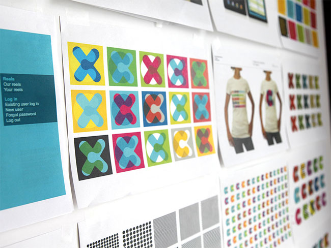
Urban Outfitters has an incredible lifestyle concept which is a reflection of the way our customers shop, their wardrobes and their lifestyle objects. As we believe in the honesty of that concept it is important that we as a company, constantly evolve to reflect these changing needs. The brand message follows this evolution, and as such Urban Outfitters completely rebrands itself every six months (as a minimum). Everything is refreshed, from logo, to bags, to point of sale to the store environment and it’s an exciting environment to be in. I have been producing and working on these designs for 11 years and you can see the many changing faces of this concept on my site http://www.stuart-reed.com.
![]()

![]()
The logo designs you see here were produced for the Spring/Summer campaign for 2011 and were a return to the more tactile and hand-drawn roots of Urban Outfitters. The hand-rendered elements grew from sketchbooks and collaborations within the team, through test stencils and window treatments to the finished articles sent with direction across the 22-store European network, where they were painted directly onto the glass by our multi-talented store display teams.


![]()
Keep a lookout for the great Autumn/Winter stuff on it’s way early- to mid-August at your nearest Urban Outfitters.

View more Urban Outfitters work on Stuart Reed’s website.

Comments
I’m sure it’s unintentional, but it reminds me of the CooperVision identity system by SiegelGale that I saw on Brand New recently… (and I’m sure SiegelGale weren’t the first to do a blue watercolour circle…) http://www.coopervision.com/
Would have been interesting to see and/or discuss how this does or doesn’t affect the website, which seems to mutate frequently as well.
Also would have been nice to see some explanation of the strategic inspiration behind these designs, if there is one. The discussion of what strategic problems the designs are meant to solve is one of the best things (usually) about this site, insofar as it addresses identity issues rather than simply aesthetic ones.
Designers panic. Brand identity creatives rejoice.
Original anti-design branding.
Nice…
A.
Wow! I love the way they painted the new logo directly onto the glass. So smart!
Call me weird but my favorite is the staff badges!
Yeah that painting idea is really neat, expensive but worth it. Paul makes an interesting comment about ‘strategic inspiration’ I wouldn’t say there was one, fashion is fairly superficial and moves in waves, these seems like just a season thing.
Nothing is so constant as change?
This is very nice. A little bit “non-profit” (on me), but when spray paint used – yes, nice!
I like the simple look of this, when designers just doodle around and come up with something with a natural, human feel. Not everything has to be clean and sharp it can be hand drawn and lively.
Not bad.
I have to say their site doesn’t look too good, it clearly doesn’t fit in with this design.
I absolutely LOVE the imperfect, undeniably human element the window painting brings to the often-crisp typographic treatment we usually see in fashion branding. Would’ve been interesting (albeit challenging) to see serifed versions of the same works.
It definitely fits with the customer demographic. As someone mentioned above if they are refreshing their brand every six months are they following this with their website and other touch points?
I like the strategy behind it. You can’t get left behind if your leading.
That is awesome, I absolutely adore the way they do the shop window sign!
Yes, website doesn’t match at all, it’s very inconsistent, they should address that.
Damb!!! havent been to my local store recently to see these, are they still up?
“Fashion is a form of ugliness so intolerable that we have to alter it every six months.” Oscar Wilde