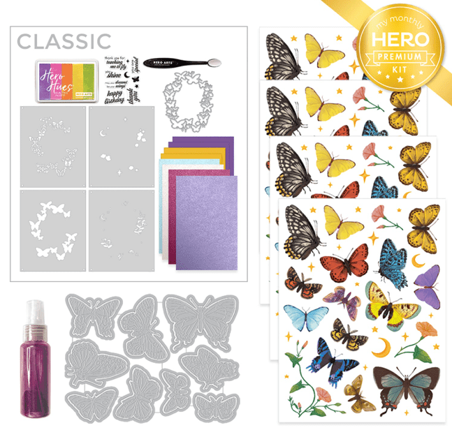
Hello Folks! Scott here with a new set of 10 cards inspired by the My Monthly Hero June 2023 Classic and Premium kits. We’re headed to the beach this month with a new HeroScape stamp set and Beach Window Fancy die that easily transports us right to the seashore!

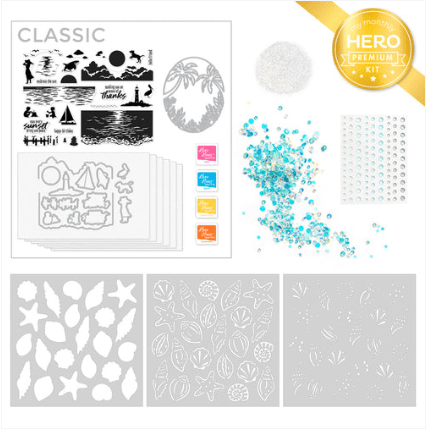
CLASSIC KIT INCLUDES:
• Clear Stamp Set, 6″ x 8″
• 14 Coordinating Dies
• Beach Window Fancy Die
• 4 Reactive Ink Cubes (Splash, Taffy, Lemon Drop, Creamsicle)
• 6 Sheets of Watercolor Paper, 5.5″ x 8.5″
PREMIUM KIT INCLUDES: • Everything in the Classic Kit AND…
• 3 Color Layering Seashells Stencils, 6″ x 6″
• Sea Dot Enamel Stickers
• Bahama Bliss Sequins
• Iridescent Embossing Powder, .25 oz
I will once again work on making five cards just using the Classic Kit and then five more adding in the Premium supplies as well. Now, the ink cubes included in this kit are water-reactive, and we have watercolor paper too… It seems like we’re being encouraged to use these inks on the watercolor paper…!
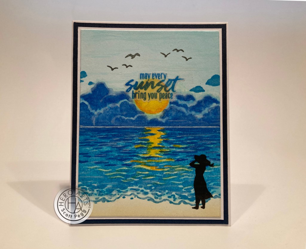
On a 4.25′ x 5.5′ piece of the watercolor paper, I stamped the first (largest) water stamp using Splash Reactive ink. Then I stamped the second ‘ripple’ stamp using Blue Hawaii Reactive ink. I had to stamp both of those multiple times to get a decent impression, though I still had some deep textures that weren’t capturing the ink. I did a light ink blending for the sky with the Splash ink, and stamped the clouds using Blue Hawaii. I stamped the sun and the small ‘ripple’ stamp using Lemon Drop and Creamsicle Reactive inks, and added the extra smaller clouds using Splash ink. Finally, I ink-blended some Antique Linen Distress Oxide ink on the bottom for the sandy beach.
Once everything was stamped, I still had some white texture spots from the watercolor paper that just wouldn’t ink up. Time to break out some water and a paintbrush…! That’s just what this needed… I was able to blend away all the texture spots that were resisting the inks, added a little more color where the sea meets the sand, got some nice striations in the sky, and de-emphasized the stark outlines on the big cloud stamp. This feels little more painterly to me! I also used some Iridescent Watercolor ink (from the Oct. ’16 MMH kit!) on the sun and its reflection to add a touch of glitter, and I drew a thin line between the sea and sky with a white gel pen to define the horizon. I added the birds stamped with Granite Core ink, and trimmed the panel down to 3.75″ x 5″, added a thin White mat, and a thicker Dark Blue Pearlescent mat and then glued all those to a White A2 card base.
I stamped the silhouette 3 or 4 times using Intense Black ink, let that dry overnight, and then (the next day) stamped it two more times with the same ink. That just about completely erases the ripple lines she’s stamped on top of. I wasn’t sure where I was going to put this sentiment so I stamped and embossed it on a piece of vellum using the Blue Hawaii ink and clear embossing powder. I die-cut the sentiment using the matching die. I finally decided to center the sentiment on the sun, so I ran the die-cut sentiment through a Xyron Sticker maker and stuck it down in place. Well, this card took an inordinate amount of time with my fiddling around and experimenting with this kit, but I really like the finished card. I’m not too sure about this sentiment – though you may just be sending peaceful thoughts to someone at the end of their day, this does feel like a bereavement card to me… the sun breaking through the clouds and a glimmer of hope on the horizon.
Enough with that watercolor paper… let’s see how these stamps behave on some plain card stock!

On a panel of plain Staples Ivory card stock, I stamped the big water stamp in sections – Splash, Blue Hawaii, Taffy, to get a little more color on the water. I used a blending brush to pull some of that color up into the sky, and ink blended some Lemon Drop ink on the upper part of the sky. I stamped and embossed the second ‘ripple’ stamp using Embossing and Watermark ink and Clear embossing powder… that adds some nice shine on the water! I stamped the setting sun (or is that rising?) with the Lemon Drop and Creamsicle inks and used the same inks on the small ‘ripple’ stamp and embossed that with more Clear embossing powder. (the Reactive inks stay wet long enough to emboss with them!)
I die-cut the Beach Window Fancy die from some of the watercolor paper (I’m sure I had some grand idea about painting it..!) and discovered that the next-to-the-largest HA Oval Infinity die matched the oval of the Fancy die with just enough clearance to make a perfect little frame. I die-cut the inked Ivory panel with the same oval die and glued both pieces together and down to a White card base.
Using my MISTI Stamp Platform, I curved the sentiment to match the oval, stamped it with Intense Black ink, and embossed it with Clear embossing powder. I like the sentiment outside of the frame… no competition with the beachy scene inside the oval! And I really like that window die! A good amount of detail without being overly fussy – works quite well in simple white – adding great detail and texture to the card while not drawing focus from the scenery!
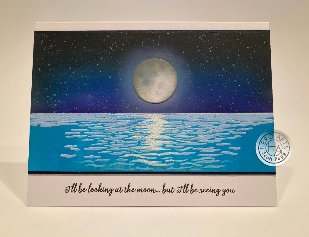
Let’s try something like this but with a night sky instead… that round sun stamp could just as easily be the moon, right?

On a panel of Pitch Black card stock, I stamped the large ocean stamp with HA Unicorn White pigment ink and let that dry thoroughly before stamping it again with Blue Hawaii Reactive ink. I turned to some Perfect Pearls for the second “ripple’ stamp, inking that with Perfect Medium ink and using the White Perfect Pearl on top. Nice pearlescent reflection without any sparkles! I stamped the moon and the small ‘ripple’ stamp with Embossing and Watermark ink and embossed those with White Sparkle embossing powder (from the October 2020 kit!). Now there’s some glitter! I stamped the clouds (upside-down) on the top of the panel with HA Unicorn White pigment ink, and used a White gel pen to add just the smallest sprinkling of stars in the sky.
I cut a panel of Dark Blue Pearlescent card stock to 4 1/8″ x 5 3/8″ and die-cut the window die from the center. I trimmed down the stamped panel to match and glued them both together and down to a White card base. I stamped the sentiment on a scrap of the pearlescent card stock with Unicorn White ink and embossed that with White embossing powder. I die-cut the sentiment with the matching die and glued it to the card front… kind of feels like an extension of the moon’s reflection on the water…! I love it when we get sentiment dies in our kits!
We have all sorts of people and items to populate our seashore, but it felt like the Window die limited the space where we could add those images. I thought I’d skip some of the items in our kit to help me make a more complete scene.
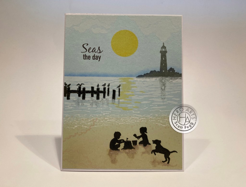
I took a panel of Hero Hues Arctic Card Stock and stamped the second “ripple’ stamp with Unicorn White ink. I also stamped the clouds in the same ink (upside-down again!) on the top of the panel. I ink-blended some Antique Linen Distress Oxide ink on the bottom of the panel for our beach.
I stamped the lighthouse with Granite Core ink and the dock with Charcoal Core ink, and the kids and dog with Intense Black ink. I got some nice reflections in the water by stamping the dock and lighthouse lightly on a piece of acetate, flipping that over and pressing the ink down underneath the original stamping. I stamped the sun in the sky and its reflection ripples with Lemon Drop ink, and added some of the bird footprints going in a few directions down in the lower left corner.
I printed this pun-y sentiment (and oldie but a goodie) on the panel using my Silhouette Software and the Black Jack and DIN Condensed fonts. This is a pretty good approximation of the sentiment fonts in the stamp set. I used some of my Pebbles Chalk pastels for the dark “mist” on the horizon, and some Micro brushes with Frayed Burlap Distress Oxide ink for the shadows on the kids. Some White Gel pen adds more foamy white water where the sea and shore meet. I trimmed this panel down just a little bit and glued it to a White card base. I really like the soft colors here, as well as the reflections and the shadows on this card…. very serene…!
These HeroScape stamps are obviously intended to be used on an A2 card in a portrait orientation – they are all 4.25″ wide. Well, you know me… I’m not happy unless I can figure out a way to use those stamps in a landscape orientation.
I LOVE THIS! The landscape orientation really makes the water/ocean/lake look much more expansive! I stamped the big stamp using Splash Reactive ink, masked off the sky and ink-blended more of the same ink on the sides to extend the stamp to 5.5″ wide. I stamped the second “ripple” stamp with Embossing and Watermark ink, extended that stamp to the edges with an Emboss-it pen, and embossed all with Glacial Blue embossing powder (also from the MMH October 2020 Kit). The smallest ripple stamp is embossed again with the White Sparkle embossing powder.
I flipped the masking around to ink-blend the sky using Blue Hawaii, Purple Galaxy and Licorice Reactive inks. I spattered the stars with some White India Ink, and blended a little moon halo with Unicorn White ink. I die-cut the moon from White card stock using the included die, and ink blended it with Charcoal and Granite Core inks. A tiny round blending brush gives us some nice “craters” on the moon. I trimmed that panel to 3.25″ x 5.5″, added a thin Dark Blue Pearlescent mat (top and bottom) and went to work on my sentiment.
I printed this sentiment directly on a White card base using my Silhouette Software and the Dream State font. This is the ending lyrics to that old stand-by “I’ll Be Seeing You” which was a big hit for Bing Crosby in 1944 – after being featured in the Ginger Rogers and Joseph Cotten movie “I’ll Be Seeing You” that same year. It seems just about everybody has made a recording of this song from Billy Holiday to Michael Bublé – Rosemary Clooney’s is my favorite! Later, the song became notably associated with Liberace, as the theme music to his television show of the 1950s. A lovely Miss You card!
That feels like a good exploration of the Classic kit. Let’s move on to the Premium kit and those fun layering stencils.

Since we have Splash, Lemon Drop and Taffy inks in this kit, I thought a rainbow was a good start! I blended Stencil ‘a’ (with the large openings) using only the three inks… and got a great green and a nice orange with the blending. I used Antique Linen Distress Oxide ink for Stencil ‘b’ (the outline stencil) and I couldn’t resist doing some foiling with stencil ‘c’. I used the DecoFoil Transfer gel through the stencil, let that dry, and ran it through my laminator with the Gina K. Gold Sequins foil.
This came out so nice that I almost couldn’t bring myself to cut it! I even considered making a 6″ x 6″ card – maybe even a mini slimline card… but, ultimately, I had to return to my standard A2 card format!
I cut the stenciling down to 4′ x 5.25″ and glued it to a thin Metallic Gold mat and down to a White card base. I created this sentiment (good pun!) using my Silhouette Software, printed it on White card stock and cut it out (along with four “blanks”) using my Silhouette Portrait. I glued all five layers together for a dimensional chip-board feel. I added some sparkle highlights on the sentiment using a Gelly Roll Stardust pen and glued it down to the card front. I’m loving this! The photograph doesn’t do the foiling justice – very shiny in person! Looks like a party just waiting to happen!
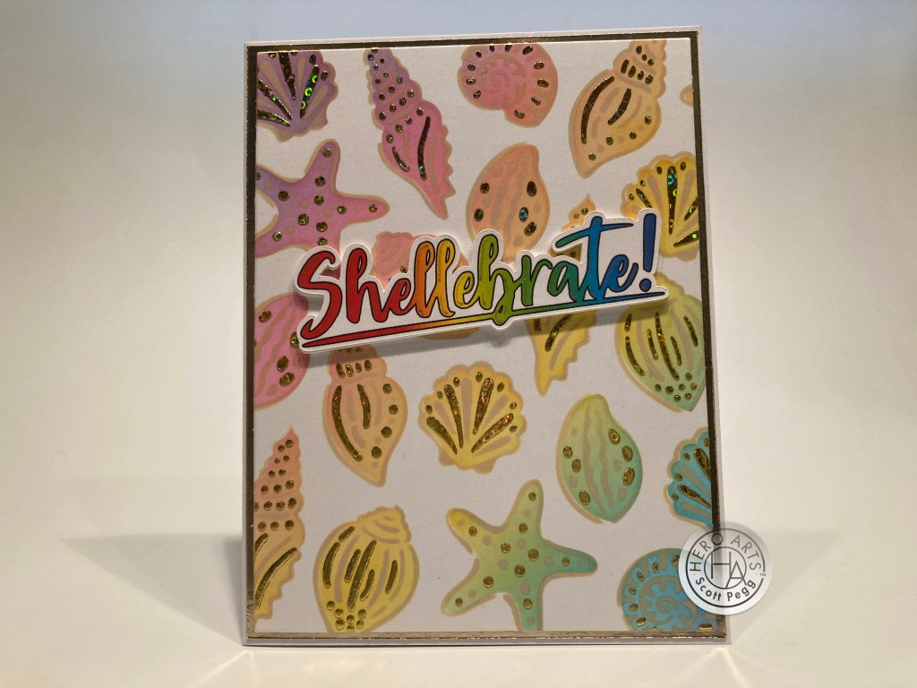
Now, rainbow seashells aren’t exactly accurate, so I thought I would try a more realistic color palette for these shells.

I like this one almost as much as the rainbow shells! Very beach-y! On a plain panel of Staples Ivory card stock, I used Antique Linen Distress Oxide ink for Stencil ‘a’, Frayed Burlap Distress Oxide ink for Stencil ‘b’, and Aged Mahogany Distress oxide ink for Stencil ‘c’. Of course I couldn’t leave well enough alone, and added some Hero Paste Glitter over the ink on Stencil ‘c’ – it took on the ink color beautifully, and added a nice touch of sparkle as well. Once the glitter paste was dry, I trimmed the panel to 4″ x 5.25″, added a metallic Rose Gold mat and glued those to a White card base.
I liked my “Shellebrate!” sentiment so much I created this dijon-yellow version. I printed, cut and glued five layers as I did previously and even added the glitter highlights as well. We do have this “happy birthday” sentiment in our kit and it turned out to fit just perfectly under the right side of the sentiment. A perfect card for anyone celebrating a birthday on the beach! And that glitter paste adds a really great texture to this card as well!
We only have five sentiments in this stamp set, so I was looking forward to coming up with some (puns?) of my own.

I really do like that Fancy Window die and, since the palm trees are quite prominent, decided that this was a good pun for a straightforward and fairly simple card. I cut the window die from some green pearlescent card stock in my stash, Printed this sentiment on a piece of Hero Hues Arctic card stock using the Hiragino Sans W7 Font, ink-blended Splash ink around the edges, and glued the two pieces together and down to a White card base.
I did manage to fussy cut three complete shells from my original rainbow panel, and added them to the bottom of the oval with foam tape. Those add a nice pop of color and shine and really anchor that Window die. Some crystals and sequins from the Bahama Bliss sequin mix adds a nice finishing touch and lots of sparkle.
I feel like I’ve short-changed the Beach Window Fancy die a little bit, so I thought I’d give it some extra attention… and we get another fun pun!

I die cut the Window die from a 4.25″ x 5.5″ piece of Bristol Smooth card stock, and colored everything with my Zig Clean Color Real Brush markers. On another panel of Ivory card stock, I masked off a horizon line, and used the Splash ink to blend in the water below the masking. I stamped the second ‘ripple’ stamp with Embossing and Watermark ink and embossed it with the Glacial Blue embossing powder. I stamped the sun and the reflection ripples with the Lemon Drop ink and embossed the ripples with the Iridescent Embossing powder. Very interesting embossing powder! As you shift it around in the light, it changes color! The yellow ripples become blue! Cool! I also stamped the leading edge of the first large ripple stamp where the water meets the beach with Embossing ink and embossed that with the White Sparkle embossing powder. That gives us a little foamy water where the waves crash on the shore!
I stamped the sailboat on a scrap of ivory card stock using Granite Core ink and die-cut it with the matching die. I stamped the pelican directly on the colored panel with the same ink. I trimmed the die-cut border on the sailboat and glued it in place – so you can see the sailors between the palm leaves! I added thin strips of foam tape behind the free-floating palm branches and the top of the trunks and glued the rest of the Window die to the inked Ivory panel and then down to a White card base.
I printed the sentiment on a scrap of Ivory card stock using my Silhouette Software and the DIN Condensed Font. I do love this pun! I die-cut the sentiment with an LF Everyday Messages Banner die and mounted it to the card front with foam tape. That really anchors the window die perfectly. I enjoyed coloring the window die (not much else to color in this kit!) but you need to be careful that your background doesn’t compete with your colored die-cut! Love it!
Now, this isn’t a pun… but it is a great play on words…! When I saw the (obviously) Orca Whale stamp I knew what to do!

I stamped the whale in position on a panel of White card stock using Intense Black ink, and I stamped and fussy-cut a mask for the whale at the same time. I placed the mask on the whale, then the circle “sun” mask on top of that and then I masked off the horizon line and ink blended Blue Hawaii below the horizon mask. Then I masked off the water, and ink blended the sky with Lemon Drop ink. I removed all the masks and am left with a great vignette featuring our Killer Whale!
I die-cut the inked panel with a Lawn Fawn Stitched Rectangle die (4.5″ x 3.25″) and printed this great sentiment using my Silhouette Software with the Dream State and DIN Condensed fonts. I glued that to a black mat and then to a White card base. Very straightforward but quite impressive just using the Orca stamp and some simple masking. Love it!
And that completes my 10 Cards 1 Kit post inspired by the My Monthly Hero June 2022 Kits. Quite a nice variety of cards and looks this month. I almost used every stamp in this stamp set… I didn’t get to the cairns stamps (the stacked rocks) and I didn’t use the “hello friend” sentiment, but everything else is on the cards! The Beach Window Fancy die is terrific either plain or painted… The seashell layering stencils are simply gorgeous and can be ink blended in an infinite variety of colors… and the water ripple layering stamps work brilliantly! I feel like I need to get to the seashore asap!

Everyone must be yearning for the beach these days as both the Classic and Premium kits have sold out already! Hopefully, I’ve been able to give you a few different takes on ways you can use this kit, and maybe even inspired some ideas of your own!
Thank you so much for sharing your time with me here today. Your support and encouragement mean everything to me! Let me know which cards are your favorites and remember to Like me, List me, Pin me, Post me, Share me with all your friends…. beware of sea urchins and jellyfish… and as always I’m sending you and yours all my Love and Light and Happy Crafting!
DISCLOSURE: This site contains some affiliate links to products. I may receive a commission for purchases made through these links (at no cost to you). As an Amazon Associate I earn from qualifying purchases. Thank you!